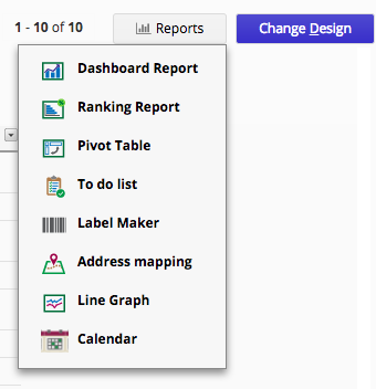
You can find Reports on the right side of your listing page or create report from the tab.
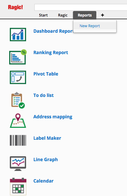
The Reports tab will display reports that you have saved, and an option to create new reports in your account.
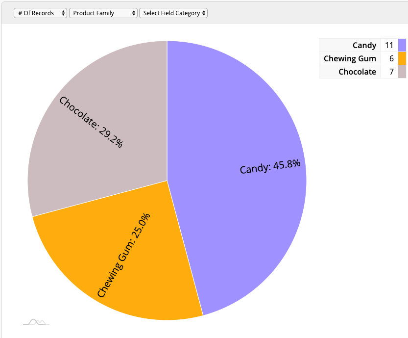
Ragic can analyze your data by generating a pie chart with the numerical fields in your database.
You can select the first field on the top left corner to determine which numeric field you want to use or you can select # of records.
The field right next to the first field is the field that you select to analyze, you will see one more available field after selecting the first field to analyze. The pie chart will only have one layer if you select only one field, and two layers if you select two fields. You can visualize the composition of your categorical data using pie chart.
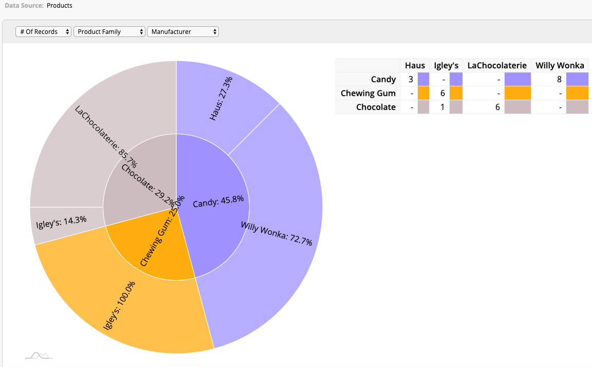
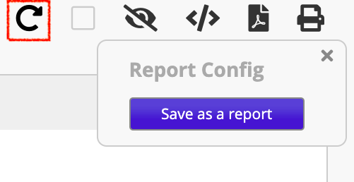
If you generate the same pie chart often, you can save your report by clicking the Save as a report button that comes up on the right side when you generate a chart.
You can also save as a pdf file or print your report by clicking the print icon on the right side.
If you want to hide the border of report when printing, you can click the border icon on the right side.
You can find your saved reports under the Reports tab for easy access.
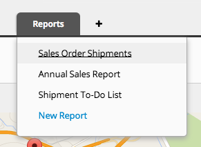
Your report will be generated according to the filter you have applied, but you can also generate reports for a certain shared view to display results within a different filtered criterion.
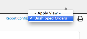
If a fixed filter view is applied to your sheet, the report will display results accordingly.
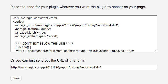
Ragic applications provide you with a tool to embed reports on your website. Alternatively, reports can be sent as a separate link to others.
The report embed tool can be found by clicking the icon in the upper right corner on any report.

If you would like to reset your report, you can click on the return arrow icon to reset it.
