Dashboard Online

Our experiences in the IT department told us that the hard work of making a bunch of data entry and data browsing function is invisible to company executives. (What? Aren’t they just simple data entry forms?) What really catches their attention are graphical charts and analytical reports.
Actually, this type of reaction is perfectly normal. An important part of the value of an enterprise system lies in the ability to aggregate all the data that everyone entered, making all kinds of analysis, to generate clear and understandable charts and reports, so that decision making executives can easily digest all the key data and trends to make a more informed decision. All the database design and entry forms are the silent but necessary infrastructures to make this possible.

Ragic Builder is working hard to use a simple spreadsheet interface to turn all the painstaking work of making rigid database infrastructures into a lighter, faster, easier, but just as powerful tool. But after we enter so much data, we’ve always felt that we’re missing the ability to see the whole picture of our data. And today, we’ve finally got our missing piece of the puzzle.
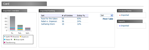
For every database on Ragic Builder, we automatically generate a dashboard for it. It will generate a chart and a ranking table for each sheet in the database.

The chart is a stacked bar chart based on cross analysis of user selected fields on the data on the sheet. For example we can visually see how many open cases in our support system, and how many of the open cases are urgent. We can even click on a region of our chart, to see which cases are open and urgent.
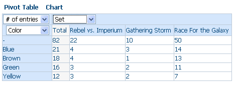
The ranking table is based on a user specified field to do ranking. Similarly, all categories and numbers can be drilled down for more detail. If you need further analysis, you can click on the “Pivot Table” link, and you can do a full pivot table analysis on your data, based on the two dimensions that you picked.
Of course, all these functions are just a beginning. We know there are many more ways that our users would like to analyze their business data. More and more features will be added to our dashboard according to everyone’s needs. A goal is to keep most these functions free from custom coding. If we can generate it automatically, let it be automatic. We’ve all spent too much time of our lives writing custom reports after another.
Category: Talking Ragic > Learn Ragic


